Saturday, March 6, 2010

Give the Pie a chance!


One of my recent HCI classes reminded me of my old Bachelor thesis at FCS Iasi (at my previous university) and how much I wish pie menus would finally claim their rightful place in everyday GUI design. Jared (our teacher) had us debating on the implications of Fitts' law and pie menus came up in the conversation.

This is precisely what my Bachelor thesis touched on. Back in the days when Windows Presentation Foundation was the new kid on the block, I looked at the problem of overcrowded desktops and Start menus. The issue was simple: I suspected that just as I was tired of navigating this
so was everybody else who had more than a media player and a browser installed on their computer. The classic alternative is desktop shortcuts - but unless you're very thorough with every new installer you run, the desktop too can easily become just a wider version of your Start menu. Let's face it, we all know people whose computers look like this:

My prototype application was called Arlequin and it ran on a dedicated mouse button (or a customized key combination) on top of all other applications. It stored all your favorite shortcuts, web links, documents and an instant search box in a pie menu positioned right around the mouse pointer.

The catch was this: the user had to define the shortcuts himself - no default installers placing them in, no "recently used", no bookmarks toolbar, no "My Computer". If you know you're gonna use them every day, put them in - if not, they can stay out of your way. And while we're at it, who cares if they're websites, games or the paper that you're just working on? Why discriminate? They're all just as important if you have certain use patterns. So let them all live together in the same place, at the tip of your mouse.

So after weeks in a gestation process that looked like this:

and some (at the time) twisted XAML that looked like this
 
It finally ended up something like this:
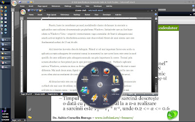
Neat, huh? Well, apparently it was neat enough for an A.

Now all of this makes me wonder - why haven't pie menus really caught on? If you have a good answer to that, do let me know.

Wednesday, March 3, 2010

My Editing Romance

I must have mentioned before my eternal passion for films. What you can see below is an elective project that I managed to swing my way into being all about video editing.

The story behind this short film is simple. Some of my fellow ITPD colleagues were making a short educational clip on how to find a good research question. My initial thought was to join their project, but I later realized that the most interesting things were actually happening behind the camera - as is always. Seeing their daily struggles with planning, filming, technology and everything else, I decided that this would make a far more interesting movie. After all, my main focus was video editing - on what, was never specified.

If I had pictures of this process, they would all be with me in front of a computer clicking around in Final Cut Pro. I suspect the only variable thing would be the size of the bags under my eyes. I adore video editing to the point that I don't mind losing lost of sleep over it. Sadly, I have no formal training in it whatsoever. Everything I do, I do from my gut feeling and my movie going experience.

But all this is not accidental. In his book How the Paper Fish Learned to Swim : A Fable about Inspiring Creativity and Bringing New Ideas to Life , Jonathon Flaum talks about how managing creative innovation is like being a film editor. I was pleasantly surprised by this metaphor and the more I looked at it, the more sense it made. He says
The editor’s concern is how to make all of the footage converge into one tightly realized idea. The editor’s task is to trim the excess and find the essential – to trace the connecting symbols, themes, dialogue and movement of the work and allow it to speak for itself as a unified whole.
Indeed, this makes sense - after an editor has done her job, there is now a finished product, where before there was just a collection of ideas. 

That being said, here's the movie.

*some of the dialogue is pretty low, so do turn on the subtitles (captions) using the button in the lower right corner.
**Disclaimer: I have credited all the short music excerpts used in this video. Their use is not affiliated in any way with the University of Southern Denmark and/or any of its subsidiary institutions. That being said, this is an amateur project and this video has not been publicly broadcasted or used for any commercial or official purposes in any way. If you find the use of any of these fragments in any way problematic, please contact me and I will take it offline.

Tuesday, March 2, 2010

The Musical Lamp

 
One of the most engaging projects I've ever done was to design and build an interactive lamp - all from scratch - in one week. This project was special for a number of reasons.

Firstly, for requiring so many different skills. Just coming up with a strong concept was not enough for this project - it also had to be realizable. What do you get when you combine foamcore, fabric, electronic wiring, a microcontroller, guitar sounds and some C# programming all in one? The answer is "Indigo - the musical lamp".

Secondly, I because I took a very creative approach to it. Right from the beginning, I considered very carefully how much time I could spend on electronics vs modeling vs programming. But artistically, I had no idea where it would end up. I just knew I wanted a lamp that people could play like a musical instrument, using both of their hands. I took the idea and ran with it, adding another level of detail as I was going along with the building process.

 
I started from a simple shape and then began to play with it to create something that would look touchable and organic. 

I then went on to give it a smoother, curvier shape that would invite people to touch it. At this point though, I became concerned that covering the foam in any of the typical coating would spoil that effect. The idea later popped up: not coating, but fabric! 


But before you can have an "artistic message" and all... you need to have the circuitry for it. I've never done more soldering in my life! What you can't see in the picture here is that my fingers were scratched and torn from knotting wires all day :).

 
Aaaaah... all those numbered wires and sockets. You can see the Arduino board in the background and my laptop ready to unleash some C# fury and guitar sounds whenever LEDs were connected. 


One magic trick I pulled out of my sleeve was to use a layer of soft coating underneath all that fabric. This made it pleasant to touch and - it later turned out at the exhibition - very huggable. A friend of mine told me it looked like a Muppet.

On a different note, I have a soft spot for high contrast, so I couldn't resist the geometric, black and white print. Great idea, since it caught everybody's attention instantly - but a pain in the neck to work with! My eyes hurt for hours! I don't recommend it to anyone. 


"Ok, so just move the lights around and listen to the different sounds it makes! Sometimes it's a guitar, sometimes a flute, sometimes.. a cat!" 

  "Was that a cat?" 

Monday, March 1, 2010

Hali Chair - the movie

Following my inner film director's voice, I decided that the best way to showcase the Hali Chair prototype would be to make a short film. My motivation was simple - although the prototype speaks very nicely for itself, there is no doubt that only the complete usage scenario can make it shine. But in true film making fashion, this is all easier said than done.

This 2 and a half minute long movie spent 3 days in my head (gestating) and then 15 long hours in the making. And that's not even a lot by industry standards! Since I'm no Christopher Nolan, scripting, shooting, directing and editing all in the same day proved draining. But I'll do it again any day of the week.

 
I love storyboarding! One of my guiltiest fantasies is to have to storyboard an entire music video on a 9 hour long flight, right before plunging into a crowded set full of people awaiting my instructions(*). On a more down to earth note, this is one of those little things that always reminds me of how much the software industry still has to learn from projects in other disciplines. 

Even in a primitive little tool like iMovie, editing is still a pleasure. I once heard a comparison between film editing and managing innovation (and creativity) - they both require a steady hand, talent and the ability to make decisions at every step of the way.

 
A good reminder of what everybody's brains looked like at the end of the day. 

Well, this is it!

if the dialogue seems too low, you can turn on the subtitles (captions) using the button on the bottom right. 
link to youtube video http://www.youtube.com/watch?v=mCrbZtnSGaQ

(*)Optionally, I'd also like a film crew following me around, shooting a 'making of', two assistant directors waiting for me impatiently at the airport and the certainty that I'll have to spend my next week in the editing room no matter what. And yes, I am fully familiar with the saying "Be careful what you wish for."


Feeling cold? Hug the chair.


_________________
Critical design is meant to raise awareness on different issues that the users would otherwise ignore. The theme of this project was indoor climate in Alsion - our university building - and the goal was to create an artifact that would address some of the problems that that its inhabitants currently have.

Looking back, I realize that in a way, the point of the project was to learn more about the creative process itself. We went through 3 different phases: getting to know our users, presenting them with a critical artifact and then designing the final prototype based on all of the above.

Having a broad definition of indoor climate - ranging from noise to room setting to temperature and CO2 levels - the first challenge was to narrow down the palette of options and focus on the most important problems that our users had.
Probably the most important lessons I've learned working on this as part of a team was that "brainstorming" is not just a word for "let's see what we can do", but a process - and it needs to be managed accordingly. Our initial failure to stick to any brainstorming recipe lead to competing ideas and tension inside the team that, in turn, prevented us from moving forward in any way. We took a step back, did our homework and then started from a clean slate and doing everything by the book. It worked wonders - in no time, we had literally produced a wall of ideas.
After two long days, the specifications for the Hali (which means "hug" in Finnish) Chair finally saw the light of day. This is a rough list - we prioritized it the next morning and then I was off to sewing and tailoring.

 
To be honest, this was all unexpectedly fun. Coming from a software background, I always find it incredibly rewarding to build something tangible that you can interact with rather than abstract lines of code.

Oh, look at the mess I've made :)


This is the final artifact. The Hali Chair is all about personal climate: using a few simple gestures, the user can warm up or cool down the chair - depending on how he's feeling. In addition to this, the Hali Chair communicates with the building's indoor climate system and its supervisor (the Window Master) so that, on the long run, the conditions in the room could be adjusted accordingly.

For a better description of the prototype, see the video in the next post.

Wednesday, February 24, 2010

Touch me! I'm a business model :)

In today's shifting economy, one of the biggest challenges is to find the right business model. In this project we worked with Servodan, to investigate the opportunities presented by one of their emerging products. We covered market analysis, design, user research, service scenarios and sales.  But the best part of it was that we showed them the resulting business models in tangible form - meaning touchable, playful artifacts that are great conversation starters and tools for reflection.
-
I got my PM hat down from the attic once again - but this time with a twist. 5 teams, 30 people, 20 different nationalities, a dozen different backgrounds, 3 weeks, one deadline. Knock yourself out! And make sure they all deliver.

At the beginning of the project I thought that most of my time would be spent in SCRUM meetings. I was wrong. Most of my time was spent trying to persuade people that "fluffy" is not a bad word. Initially, the deliverables for this project were only partly defined - since innovation can't happen in a box. Hence the fluffiness that marked the problem definition phase of the project.

This was nicely illustrated by a conversation that I had with one of my peers. He asked me "How are we supposed to start building if we don't even know what we have to build? We've spent over a week discussing it back and forth!" I told him that we were doing great. Our job was just that - to figure "it" all out. This reminded me of a very important lesson that I had learned earlier on when designing new features at Microsoft : if you find yourself pacing relentlessly around the room, staring at the white board in despair and thinking "where am I going with this", then good for you! It means you're doing your job!

 
Can't say that we didn't iterate! Can you understand anything from those posters? I know I can't. But like everything else, the posters too got clearer and clearer with time...

 Nothing like a good storyboard to show a service scenario.

 
In true ITPD style, we finished the project with a workshop for the company and everyone else interested in the project. 


___________________________________
It is indeed amazing how much more animated people are when confronted with something tangible that they can feel and move around. Note to self: props are great!

Burn the specs - make a movie instead!


Making video specifications for a project is a challenge - and it's also right at the very edge of "what's been done before". Courtesy of Jacob Buur's guidance I was part of the team who worked on the requirements for eco friendly power generators to be used in Angola by DanChurcAId .

The story is "simple":  conditions in countries devastated by war are so far from what any of us can imagine that design has to withstand a different acid test every day. We worked with video material shot in Congo (which is a similar setting) to edit a series of short movies that would encompass the most intriguing aspects about the users, their environment and their life. Our movies were then used as specifications to kick start the design of the generators.

Coming from a background of "toolbar must allow descending sorting" and "left pane must not exceed 200 pixels in width" this was a challenge, to say the least. After years of working with pages of bullet listed specs, taking this approach was both liberating and confusing. Indeed video is a powerful tool and a good picture stands for 1000 words. But I had to make sure they were the right words.

My video was entitled "Pushing the boundaries" and it included everything from a shot of an overheated engine to people boarding a 4x4 Toyota on an improvised float that was about to be pushed upstream on a muddy river. My point was to show that in Congo tools and equipment are pushed to the very limits and beyond, sometimes in ways that are unimaginable to us. The point was to make the designers and engineers develop an exceptionally enduring product. In this situation, I believe it would have been almost impossible to do this without actually showing them what things are like out there. 

One of the highlights of our project was the video card game - which is a very inventive way to work as a team to group and generally make sense of bits and pieces of video material.


Where there was once chaos, now there was order... and the starting point of 5 great short films.


But the even "brighter" highlight was that I discovered the power of movies and the magic of video editing - which has since become a great love of mine. 
 
The project ended with a workshop where the movies were presented to the team of designers and engineers working on the project. They brainstormed and prototyped several concepts… and I got to be in charge of the whole thing.

 
There I am... facilitating... and that's the talking points and schedule in my hand. 


"You want us to what?" I had probably just told them that either a) they should try to use the Lego trucks to see if they can fit in the generator parts or b) they need to wrap up in 5. 


"Dolna, let's play the last one - I need to keep these people on a German schedule!"

In case you were wondering, this is one of the designs that came out:

Those are solar panels, by the way. 

Sunday, February 21, 2010

SuperUser, SuperUser!


The project that kick started my masters last year was Design is a Game in which we worked with the students at the Umea Institute of Design to develop board games. The inspiration for each game came from interviewing a company about their business process. I went to Larsen Strings and looked at how some of the best cello strings in the world are developed with the help of a few selected musicians that provide the manufacturers with unique and very critical feedback on the quality of the products.

This idea later became SuperUser - the game which asks the question "When is a product ready to be shipped to the market, based on user feedback?" Ironically, this was the same dilemma that my team and I faced during our own design process. As it turns out, iteration and user testing are holy - but only if you brace yourself for all the opinions you’re going to get! Not once did we have to deal with conflicting feedback on the quality of the game and had to make several hard decisions on how to move forward. 

Coming from a software engineering background, one of the biggest lessons I've learned was that when you are right at the very heart of creativity, there is no specifications sheet anymore. You know where you're going to start, but you can never know where you are going to end up. 

 
I guess this is what you can call a first draft - here I was trying to put my knowledge of statistics to work and try to calculate how easy the game was to win. I didn't really get anywhere. 

Second draft - we took tour little baby out for a spin. The testers liked the game... but that's only after we saved them the trouble of reading that whole page of instructions. Note to self: nobody ever reads the instructions.  

Why is it that I always end up at the whiteboard explaining something? The discussion that we were having here later became the theme of one of my presentations - how to dim the innovation process. Once you've generated enough ideas, how do you get them to converge towards a common artifact? Fascinating topic!
Aaaa... the spray glue.. a weapon that I got very familiar with during my crusade to stick 288 (!) playing cards like the ones below. 

Oh, they love it, they love it! 
After 2 weeks of hard work, too much junk food and 3 rounds of user testing, we met the deadline with a game that was indeed a pleasure to play :)